2015 to 2017 Logo Trends by Logoland
Australia now has more than 2.1 million business trading, as of 2014-2015. This is an increase of 21,000 businesses to the 2.1 million businesses that were actively trading in 2013-14. Every successful business needs a logo, a logo is the brand of a business and should not be overlooked if the business is to succeed.
While the vast majority of businesses in Australia are small, accounting for 97 percent of all businesses, they’re shutting their doors in alarmingly high numbers. According to the Australian Bureau of Statistics, more than 60 percent of small businesses cease operating within the first three years of starting.
This is why effective branding is more important than ever, if you manage your business properly from the very start, starting with your brand you may have a much better change of succeeding.
See 2015 to 2017 logo trends by Logoland below from Logos created by Logoland Australia’s creative design team, where we showcase a nice collection of logos that our designers created from the years 2015 to 2017, the examples include; Ellipse logos, Black logos, Vibrant Logos and Square Logos.
1. A bit rounded
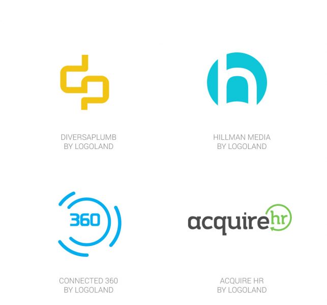
These simple, rounded and modern logos were created throughout 2015 to 2017, this shows how diverse ellipse logos can be or any style of shape can be turned into almost anything by designers with creative thinking. From filled ellipse logos with colour to simple line ellipses, the example above shows how different logos can be although they use a common shape.
2. All Black
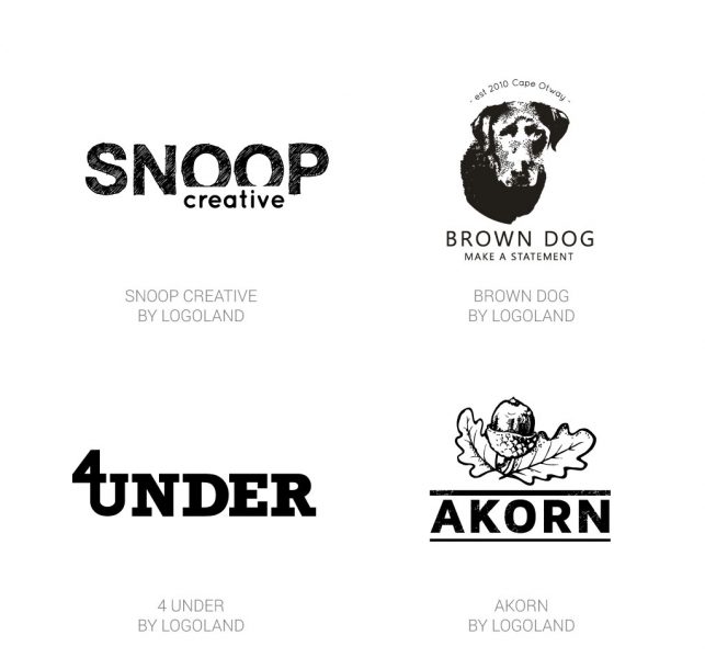
Who says black is boring! or out of fashion. The showcase above shows how modern black or monochrome logos can be. From simple, modern WordPlay design to illustrative pencil-like designs these logos show how amazing and elegant black logos can look.
3. The Vibrant One’s
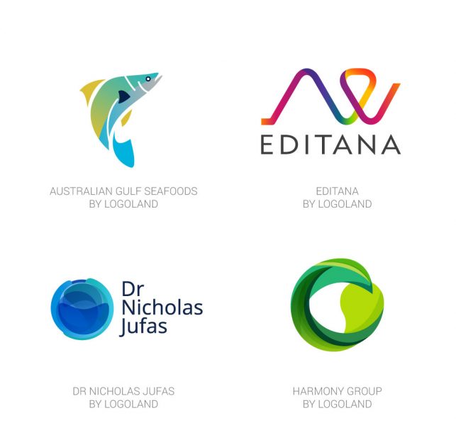
Vibrant anyone? The logos above show how beautiful and professional vibrant and colourful logos can be. From a seafood importer to a doctor, anyone can have a vibrant and colourful logo. From simple flat colours to beautiful colour overlays thee vibrant logos display how well colour can be utilised and show the very best of the creative abilities of the Logoland Design Team.
4. A Little Square Shaped
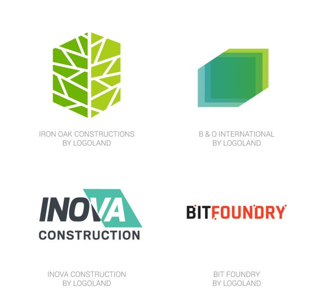
Who says square can be common or boring? The showcase above displays the many uses a creative graphic designer can give to a square shape. From colour inverts to square dots, these logos provide the perfect example of how a very common square shape can be turned into something unique and amazing.
Thanks for reading 2015 to 2017 Logo Trends by Logoland! if you liked this post please share it on social media by clicking the share buttons, thanks! Paulina Gallardo designs custom logos for clients at Logoland Australia, compare our logo design packages and start today.
Similar posts that may interest you
2015 to 2017 Logo Trends by Logoland
1300 Anonymous logo for Crime Stoppers
Pizza Hut’s New Logo
Brand Creation and Logo Design – How does it work?
