The Apple Company Logo. This is the story behind the Apple Inc. name and its logo. Some would have thought that the name Apple was too simple or not suitable for a computer company, but Steve Jobs chose it!
So it can’t be bad, right? Steve Jobs was a very smart and creative man, he is to be admired as an entrepreneur and inventor of great innovative ideas. Everyone who is starting a business should see the movie – Jobs and learn from his experiences and his success – it was not easy, that’s a fact! Learn about the Apple Company Logo right here!
Having a role model is important in business as most successful business people have role models and look up to someone, having inspiration to do what you need to do is important. Learning from others is good, as long as your ideas are original. Business branding should be unique, the logo design should stand for something and it should be invented and designed with a purpose behind it.
Firstly, why was the company named Apple?
Apple was formed by Steve Jobs, Steve Wozniak and Ronald Wayne on April 1st 1976. It was incorporated as Apple Computer Inc. on January 3rd 1977 and was named Apple Inc. on January 9th 2007. Now Apple is one of the largest companies in the World. In 2013 Apple surpassed Cocoa-Cola to become the world’s most valuable brand in the Omnicom Group’s “Best Global Brands” report.
As Steve Jobs said in the movie ‘Jobs’ that, “Apple, its the fruit of the Earth”. But it is said that he and Steve Wozniak named it Apple because they worked at a place called Apple Orchard at the time.
Why is Apple Inc. called Apple?
Steve Jobs and Steve Wozniak came up with the name Apple for the company as they were travelling to showcase the computer that was created by Steve Wozniak and later greatly improved and marketed largely with the help of Steve Jobs.
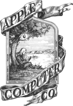
April 1st 1976, the first Apple company logo was designed by Ronald Wayne. The border reads “Newton…A Mind Forever Voyaging Through Strange Seas of Thought…Alone”.
April/May 1976 – August 26, 1999, The colourful Apple logo was designed by Rob Janoff and is a rainbow. Below are the two versions of this logo.


1998 – Present, the Apple logo colours were changed to a single colour logo, black. This logo was used on the iPod, there is another version of this logo that is used together with this logo that you can see further below.

1998 – Present, the Apple logo that is also used that was given a slight revamp once more to this more modern, glossy look is below.
Rewind to 30 years ago and this is what the Apple computer looked like
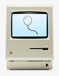
Image source: www.apple.com
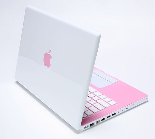
Then there is today – The Mac Book Pro
Also today – The beautiful iMac
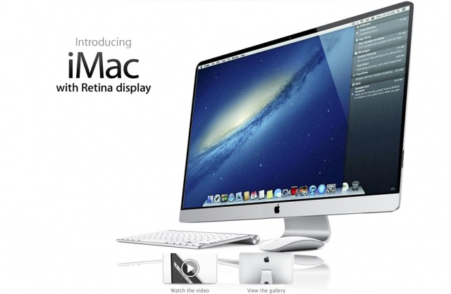
Image source: www.9to5mac.com
Article reference: http://en.wikipedia.org/wiki/Apple_Inc.
Thanks for reading! if you like this post, please share it, it is appreciated!
When you decide on a designer for your brand, ensure that you select one that is experienced in designing brands. Will the designer give your logo design enough thought? do they have an effective design process? do they carefully research, plan and design your logo design concepts? and finally, will you get a unique logo design to represent your individual company?
Similar posts that may interest you
Inspiration, colour selection for different backgrounds
What is the advantage of having a logo designed online?
The best free Google fonts
Why it’s important to have a professional business image


