Six Years of Pantone Colour Trends. The following is a year by year Pantone Colour Trends Report for a 5 year period and also what the outlook is for the 2014 Pantone colour trend!
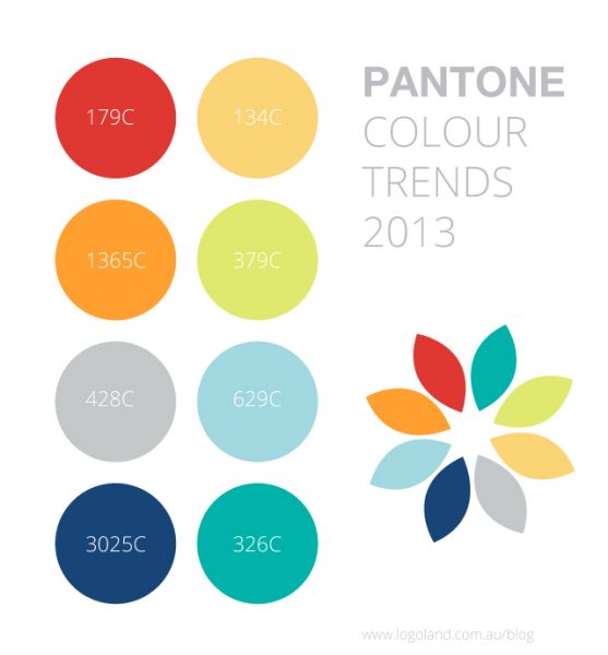
1. 2013 year colour trends
2013 was a soft, pastel like colour year! the year for happy and kind colours. These colours are excellent for use on logos/new brands in the year 2013. The colours are bright but they are soft to the eye, they are appealing colours to look at and are most of all very relaxing.
2. 2012 year colour trends
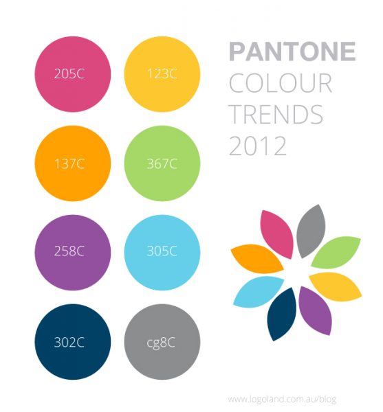
2012 was a slightly darker but still bright year, nice colourful colours were part of the 2012 year! the year for happy, rainbow like colours. You would have seen lots of brands, website and advertising material that used similar types of colours in the year 2012. The colours are bright, they are appealing colours to look at and they make you feel happy.
3. 2011 year colour trends
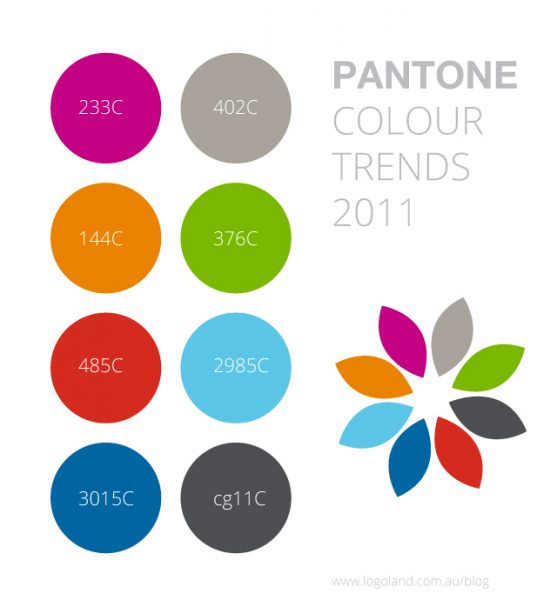
2011 was again a darker colour year, 2011 was filled with solid colours! The colours are nice and bright but were less pastel like when compared to the 2013 colour trends.
4. 2010 year colour trends
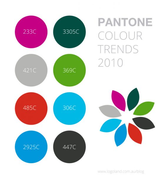
Whow! are the colours getting darker or is it just me? 2010 was again an even darker colour year, 2010 included solid more darker colours when compared to the more recent years like 2013 and 2012. This is a good comparison, even I am noticing the difference now!
5. 2009 year colour trends
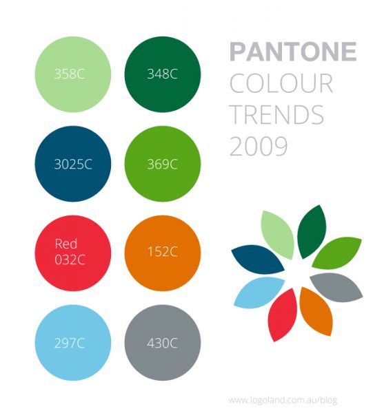
2009 was again a solid more darker colours year when compared to the more recent years like 2013 and 2012. Green was very much used throughout the design industry, greys and oranges were popular too.
2014 Colour Trend
When we compare the colour trends for the years 2009 to 2013 to what the outlook of the future of colour looks like, these colours are not so bright and happy. They are still nice, solid colours but if you are looking for modern colours see what we have included below! 2013 would be the closest match to what is coming up next and off course! its the most recent year!
Last but not least here is our outlook for what the colour trend will be like in 2014!
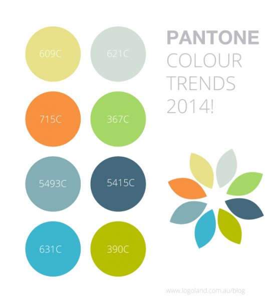
2014 may be a year with soft relaxing and happy colours that are nice to look at, similar to 2013. The trend will follow and we will see many new brands using nice pastel like colours. The year will be a great year for the use of elegant, modern and light colours.
The images on this post are copyright of Logoland Australia.
Are you an Australian business in need of a colourful logo design? Logoland Australia are a Melbourne based graphic design company and design really nice colourful logos.
Similar posts that may interest you
10 successful brand redesigns
How our eyes see colour
Logo Design Process
Logo Design Styles
